Panini’s 2011 Rookie Ticket Teaser

By Andrew Tolentino | Football Editor
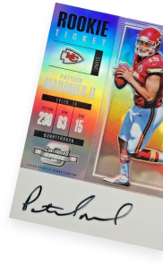
The collecting world typically doesn’t get a glimpse of Panini America’s historically successful Playoff Contenders line until later, if not, toward the latter part of any given football season. This year, the company’s sneak peek at the January-releasing 2011 Playoff Contenders Football Rookie Tickets offers a welcomed exception.
Even incomplete, without the ink, Panini’s autographed Rookie Ticket cards are consistent hot commodities in the hobby.
As the manufacturer mentioned, “For just the fourth time since 1998 (but the second time in three years), one of football’s flagship brands will utilize a horizontal format and perhaps its most vibrant color schemes ever.” Moving away from full-body photography on vertically oriented, darker color schemes, the coming release could be a key evolution point for these coveted Rookie Cards.
Take a look at the previews below and scroll back up to let us know what you think.


Maaa, I don’t really like these to be honest
Really like the look of these. Nice clean layout, with good photos. Interested to see them after they’ve been signed.
Not really liking the look of these this year…
Contenders is 1 of 2 releases I always look forward to and buy but this set from what vie seen doesn’t get me excited. It may be cause we don’t get the profile of the whole athlete, i dunno… Just doesn’t seem as good!
My first reaction was “Huh. That’s different.”
While I have never been a big fan of what is always one of the most-collected autographed RC lines out there, this one does have a pretty distinct feel to it.
I have a feeling I (and others) will like them more once the (on-card?) autographs are applied.
I like the look this year. I really like that there is a designated space for the auto so it can be featured properly. The bright color scheme is cool too.
Not a big fan of the layout. Like having the space for the auto, but the ticket part and the player part should be switched at the very least. I like full body shots of the players. This one has too much wasted space with the ticket part. I get the idea, but it could be fit in the player spot just as fine and then you could get a full player shot.
Love the fact the finally put a nice clean white space for the auto to go…first time the auto will actually stand out on these and not be lost in the design…good job!!
I agree with Rob….. I’m gald to see a nice clean white area for the autograph…. NOW as long as they dont use sticker autos and ONLY have ON CARD autos …. this will be a huge hit.
thats nice of panini to show use the cards that will be impossible to get out of the packs this year.
That’s funny, “actual” … Contenders autographs are not impossible pulls.
I actually don’t like the jarring white box for the auto at all. I think that’s as jarring as a silver sticker. They’ll look fine but I would have rather had some type of light, neutral background color there.
A lil bland.Stop trying to copy old NFL looks and sticks to what has worked.
I agree with the other poster who said the player photo and ticket area should be switched. It’s probably too late for that to happen, so I’ll move on. THANK YOU for the autograph space. My biggest pet peeve (and the reason I never bought Contenders) was because the auto was always hidden or obscured by the shiny reflective surface of the card and/or print on the card. We collectors like to see our autographs, believe it or not. Also….I’m hoping for on-card signatures in that clean white space you’ve designated….please?
not digging it at all
Well it looks like contenders, you know the old contenders that playoff used to put out. Panini isn’t exactly inventing anything new here. The white box only tells me that there will be many sticker autographs. I loved last years cards, and was a huge fan of 2001 contenders which this reminds me of, but I think this is a step backwards for the contenders issue.
Kaf
2010 is way better looking. 2011 looks like a plainer, less artistic, version of 2009 Contenders. I wonder what the Cam Newton autos will be selling for….