Our Favorite Cards from the First Half of Topps Project 2020
When Topps Project 2020 reached the halfway point, three of our staff members active in collecting cards from the set reveal their favorites up to that point. They have followed the progress from rollout, to the Memorial Day weekend bubble, to the so-called crash and back to consistent print runs.And speaking of print runs . . . they had nothing to do with these individual rankings. This is simply an appreciation of the art.
Ryan Cracknell, Beckett Hobby Editor
#1 Dwight Gooden by Tyson Beck #12
This is the card that made me really take notice of Project 2020. I’ve been a fan of Tyson Beck’s work since the Topps Fire line debuted several years ago. Here, he digs into nostalgia in a very authentic way, and it’s not just a given for using such an iconic card. The embellishments take me back to school where we’d make doodles of our heroes in our notebooks. The orange gradient is another thing that makes this card glow.
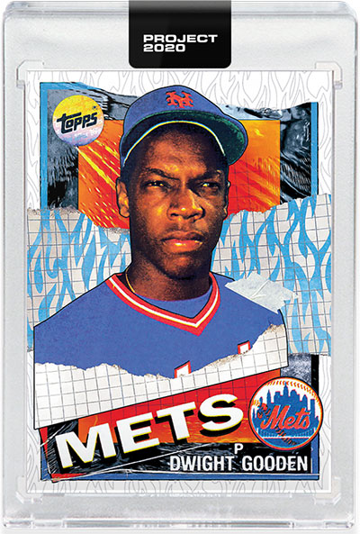
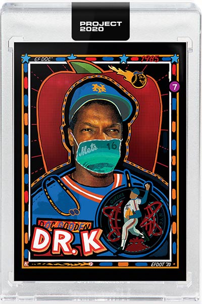
#2 Dwight Gooden by Efdot #137
With all of Efdot’s cards, you’re guaranteed to get some contrasting whimsy of bright colors and dark backdrops. But it’s the little additions that give his cards bigger meaning. His Gooden encapsulates this by playing off of Gooden’s Dr. K nickname and making the pitcher an actual doctor. But the mask takes on greater meaning given the times we’re in.
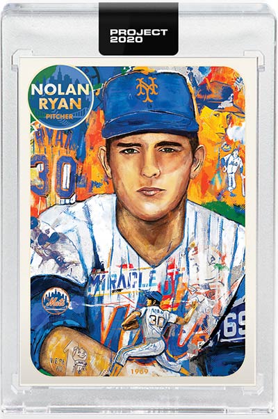
#3 Nolan Ryan by Andrew Thiele #67
Thiele’s collage approach packs a lot of stories and symbolism into all of his 2.5 by 3.5 cards. I’ve connected with several of them so far but none more than his Nolan Ryan. It’s the first official card to show the Hall of Famer during one of his defining moments, his one-sided brawl with Robin Ventura. It’s right there on Ryan’s shoulder and yet it blends in so easily that it’s easy to miss.
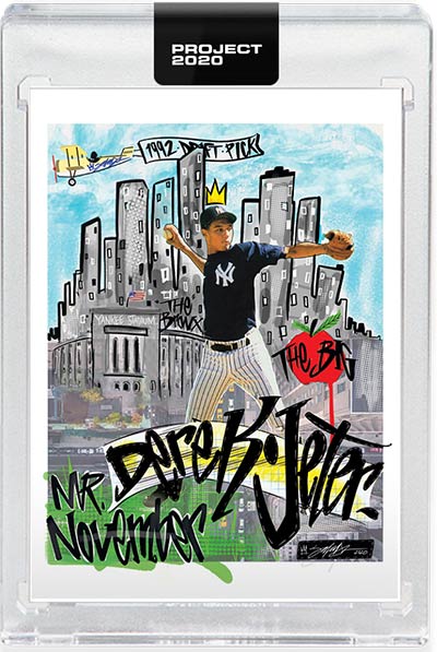
#4 Derek Jeter by King Saladeen #29
King Saladeen’s graffiti style is cast perfectly against the New York skyline. The additional details bring the card together with a lot of balance. There’s a lot on this card when you look at it, but it doesn’t feel too busy.
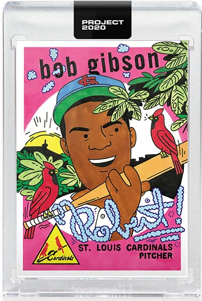
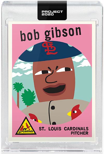
5. Bob Gibson by Ermsy #84
From the beginning, Ermsy’s work has taken cards to some interesting places. And while I get vibes of scratch ‘n sniff stickers and Saturday morning cartoon vibes throughout his body of work, I’ll admit I don’t necessarily know what to make of some of the stretched body parts and long smoke trails. And maybe that’s why I like Ermsy’s take on the 1959 Topps Bob Gibson so much. It has the colors, cartoon stylings and smoke trails of his other cards, but it’s also the most literal. The addition of the cardinals and tree take me back to the Enchanted Tiki Room and Disneyland Dole Whips.
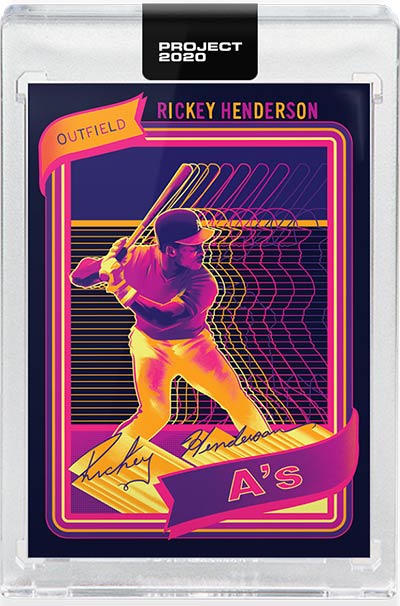
6. Rickey Henderson by Matt Taylor #21
If a baseball card even encapsulated a potential opening for a late ’70s/early ’80 sports highlight package, this would be it. The neon colors, bursting lines and repetition make for a memorable card with lots of motion.
Can’t Look Away: Bob Gibson by Keith Shore #54
I’m not going to lie. The first time I saw this card, I hated it. I still kind of do. At the same time, I’ve grown to adore it. There’s a charm to that glare. If a baseball card could be a meme, this would be the tea-sipping Kermit or whatever’s making the rounds this week. I still don’t “get” the pirate cap. And that’s okay. It’s part of the personality. I think it’s the fact this card can be taken so many ways. Is Gibson glaring? Is he mocking the collector? Perhaps he’s just smiling. Maybe it’s as simple Shore’s style having to fit into the porthole window of 1959 Topps Baseball. I don’t know and, at this point, I don’t care. The Gibson Shore has me enamored.
Mike Payne, Beckett Editorial Director
#1 Bob Gibson by Keith Shore #54
Full confession: When this card released, I thought it was the poster child for every-thing wrong with Topps Project 2020. Why was Bob wearing a pirate hat? Ahoy, Matey! But then . . .the more I looked the more I got it. Art – all kinds of expressive art – can be viewed differently even by people in the same room. One side can see it as junk, while the other sees it as brilliant. After my initial knee-jerk reaction, I began to see this Keith Shore card for what it is: something fun, something unique and what is right with Project 2020.

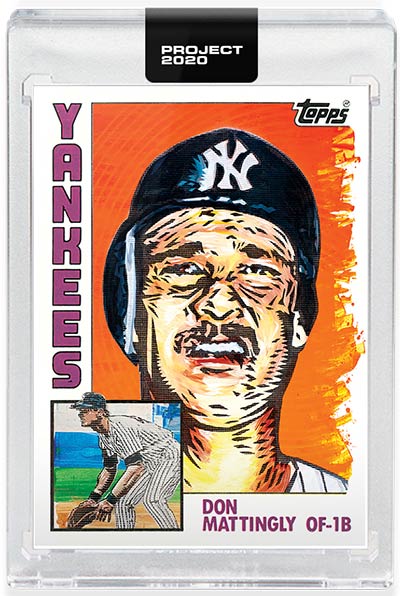
#2 Don Mattingly by Blake Jamieson #33
The card that lured me into the project. Yes, it took 33 releases to get me to sniff, but when I saw this one I took the dive into the waters. What Blake Jamieson did in switching the images of Mattingly and making the head shot the dominant image was (to me) creative, cool and caught my attention. Of course it helps that Blake is talented. I’m fascinated with the orange background, too.
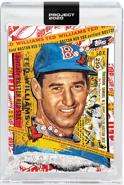
#3 Ted Williams by Tyson Beck #122
Beck’s work has impressed me from the start, but this piece made me appreciate him even more. The detail and how he incorporated elements of the card back onto the front, including part of the cartoon, is really, really good. I liked this the first time I saw it on the Topps site. And it looks like Ted enjoys his role on the card, too.
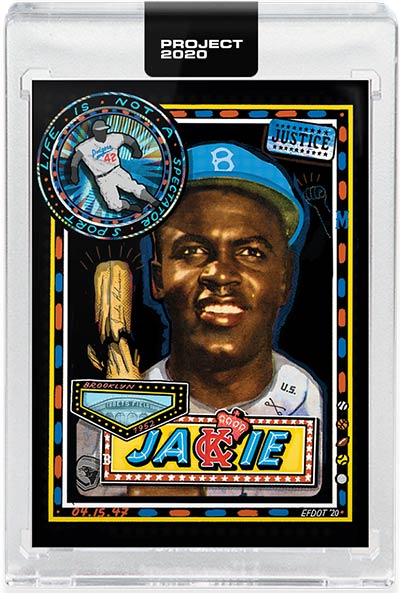
#4 Jackie Robinson by Efdot #114
Such a great card. The coloring is perfect. And the fact that Efdot used the card to help raise money for the nonprofit Color of Change just adds to the significance of this one. A real stroke of genius is the use of the KC and crown in a nod to the Kansas City Monarchs of the Negro Leagues, whom Robinson played for in 1945 – two years before he reached the major leagues.
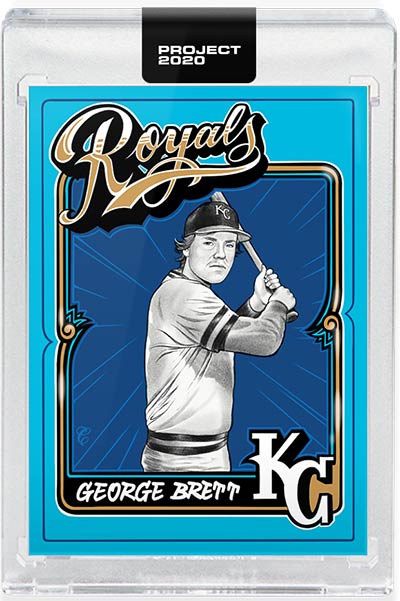
#5 George Brett by Mister Cartoon #43
I’m drawn to the blue and the fact that George Brett is one of my five all-time favorite players. That combination alone was enough for me to buy this one directly from Topps. I think this is one of Cartoon’s best works in the project from the first half. Look at a group of cards together and this one pops off from the rest. every time.
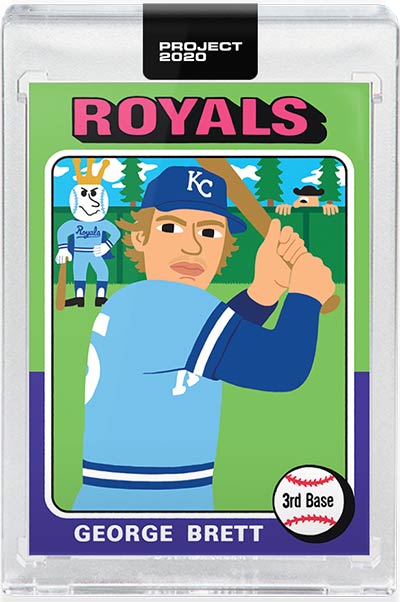
#6 George Brett by Keith Shore #102
Are those pine trees in the background, or am I just reading too much into this? If they are . . . a standing ovation to you, Keith Shore.
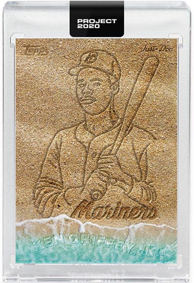
Can’t Look Away: Ken Griffey Jr. by Don C. #116
What is this? Is this water and beach scene a troll job on Keith SHORE and his 99,000-plus Griffeys? Is there a reason Junior’s name is being washed away in the surf, but the image remains? Or is it just a drawing of the Griffey image in “sand” so guys like me will drive themselves crazy thinking there’s a point? Whatever . . . I’m weirdly fascinated with this.
Alex Soriano, Beckett Ad Sales
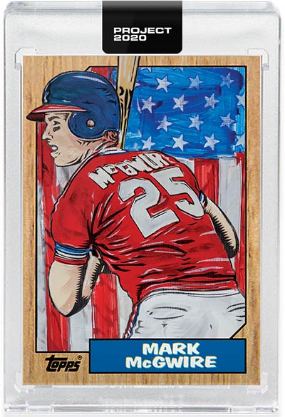
#1 Mark McGwire by Blake Jamieson #81
I began collecting cards in the mid ’80s, and the 1985 Topps McGwire Olympic card was one the prized cards in my early collection. In 1987, I remember paying $10 for a pack of ’85 Topps baseball and pulling the McGwire card. The gum stain on the back of it is still stuck in my brain. Along with the wood grain 1987 Topps cards, the ’87 Mc-Gwire was a big hit that year. Blake’s interpretation of the two cards brought me back to that year and peaked my interest in collecting again. Blake has also been very accessible on all the 2020 group pages, Twitter and YouTube. It makes you appreciate his art because he feels accessible.
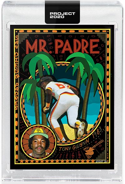
#2 Tony Gwynn by Efdot #94
Being a San Diego native, I first jumped into the set around the time this card came out. Love his Easter egg symbolism. His coloring also bring nice pop to the bland Gwynn RC. There is even an SDSU Easter egg, which is my alma mater. Efdot has also been very accessible to the hobby which makes you want to collect his pieces. I listened to him on an interview and I like how he took the time to research the players, and get input from his followers on the elements he should incorporate into the cards.
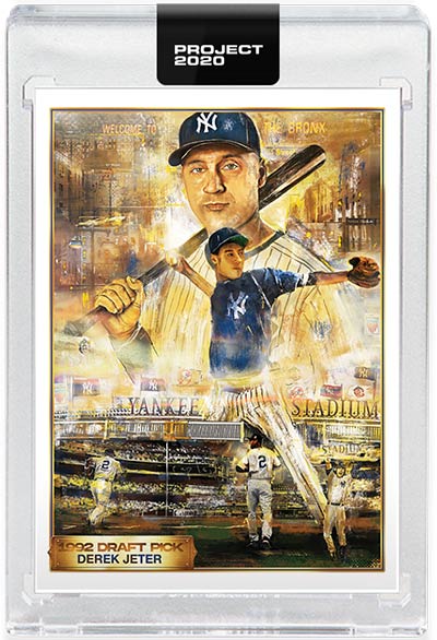
#3 Derek Jeter by Andrew Thiele ##82
I’m not a big Star Wars fan, but this card does have a Star Wars feel to it. Lots of detail with Yankee Stadium in the background and the different silhouettes of Jeter in the art.
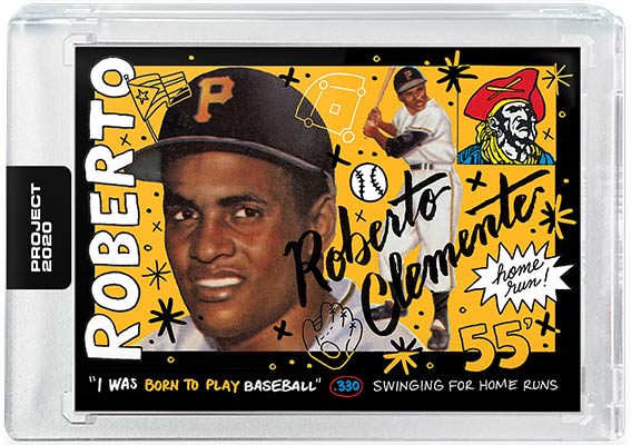
#4 Roberto Clemente by Sophia Chang #110
All the earlier Clemente cards were very monotone. Sophia Chang’s use of vibrant color on the card made it stand out to me from the previous ones. I also like the script she’s incorporated into this card and her other ones.
#5 Dwight Gooden by Efdot #137
Efdot is one of my favorite artists in the set. Project 2020 began at the onset of COVID-19 and shelter at home orders. With Doc Gooden wearing the surgical facemask, I feel this will always be an iconic card in the set.

#6 Ken Griffey Jr. by Mister Cartoon #177
Prior to Project 2020, I had watched LA Originals on Netfl ix. That documentary brought more attention to Mister Cartoon and his influence on the Hip-Hop culture. His Griffey card was the first card that caught my eye because of Griffey wearing the backward cap. I had been waiting for one of the artists to paint/draw Griffey with this head shot. It brings me back to the All-Star Game Home Run Derby when he wore his cap backwards. I would have moved this up in the ranking had it had more vibrant colors.
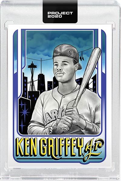
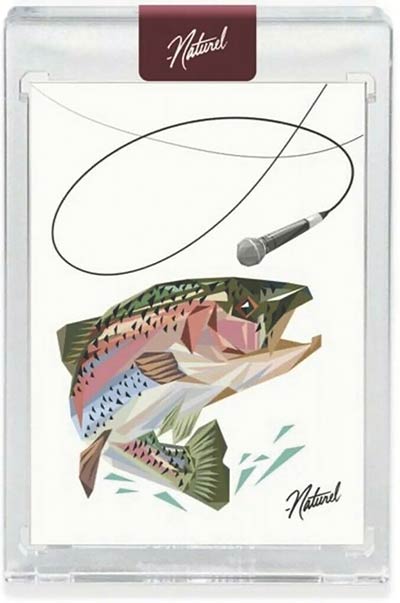
Can’t Look Away: Naturel Mike Trout Companion Card
I love the play with the mic and the trout.
