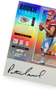
2022 Topps Baseball Card Design Revealed
It’s still about six months away from releasing, but the 2022 Topps Baseball base card design has been revealed.
Topps made the announcement via social media including Twitter and Instagram.
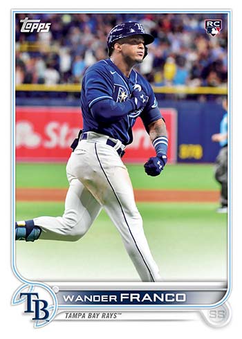
It’s back to a white border for a second year in a row. The player name is much more prominent and bigger compared to 2021.
The other prominent feature is the partial baseball icon in the nameplate. It’s a little reminiscent of the home plate in the 2013 flagship design.
A Confirmation with the 2022 Topps Reveal
Topps’ reveal of the 2022 flagship baseball design does some double-duty as well. Although a mock-up at this point, they opted to used Wander Franco.
With the inclusion of the RC logo, it confirms that his base set Rookie Cards will be in 2022 baseball card products and not late-2021 sets like Topps Update.
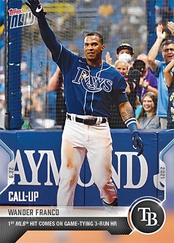
This isn’t surprising as his first 2021 Topps Now card, which commemorates his June 22 MLB debut, has a “Call-Up” notation and not the RC logo like some earlier debuts like Jarred Kelenic.
The MLBPA is largely responsible for deciding the rookie cut-off date each season when it comes to baseball cards. This is why Topps and Panini products line up with their player lists each year.
What do you think of the 2022 Topps design?


I hate the 2021 design almost solely because the names on the front are impossible to read. The 2022 design is a marked improvement on that 2021 design flaw.
Like it though the baseball at the bottom left would look better completed.
Having a name which can be read is great! But why can’t we go back to a borderless card?
Nice to be able to read the name, but honestly that is the best thing about it. And when the best thing you can say about a design is that at least you can read the name, then how good is it? Very unremarkable design. It just looks like a Bowman set instead of a Topps set.
I feel neutral about it. I liked 2017 and 2019 Topps.
You nailed it with the 2013 comparison. Perhaps what would happen if 2013 Topps and 2020 Topps Big League had a kid. Seems like it could almost double as a Bowman design. I am glad that the borders are 100 % back.
Nice and clean design. Like the boarders on flagship – keep borderless with stadium club.
MAJOR improvement over 2021. The partial logo in the bottom left looks unfinished. Would prefer a complete design there.
Much better than 2021 design, Topps doesn’t need team logo & name on front of card. Player position could be darker color.
Looks like bowman but I like how it would look as a Topps chrome refractor. I will buy some complete sets if a couple stars join Wander in the rookie class.
Looks like it should be Bowman instead of topps.
The design looks good. Its better,easier to read. A huge part of the fun is the different looks of the design. That is why its great news that Fanatics bought Topps. Hopefully they let Topps continue to do what they are good at. Keep building that 70 year tradition.
As an active collector for 45 years, would have liked a simpler design, i.e., 1957 or 1967. But glad Topps will be around; thanks Fanatics. Just hope the number of the card on back is easily readable for these 72 year old eyes