Panini America reveals photo variations for 2011 Playoff Contenders Rookie Cards
By Susan Lulgjuraj | Contributing Editor
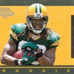
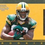
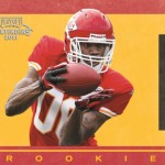
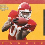
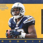
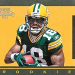
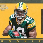
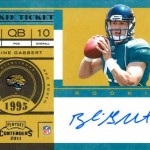
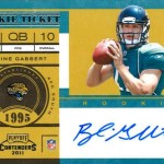
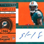
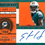
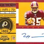
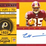
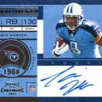
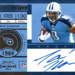
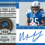
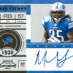
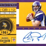
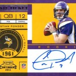
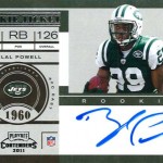
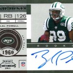
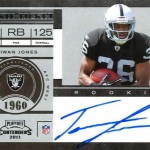
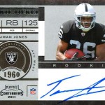
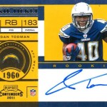
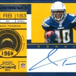
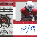
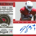
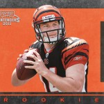
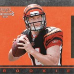
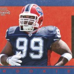
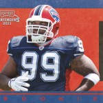
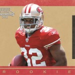
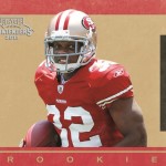
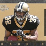
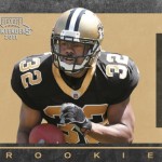
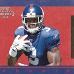
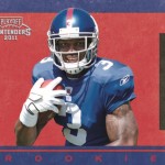
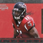
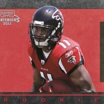
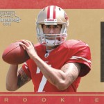
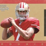
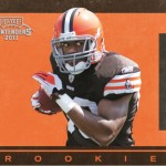
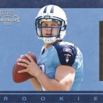
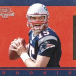
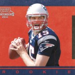
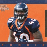
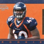
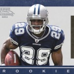
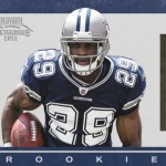
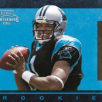
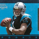
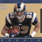
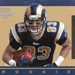
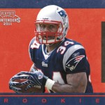
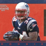
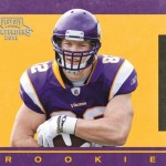
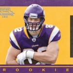
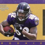
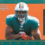
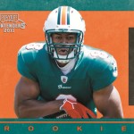
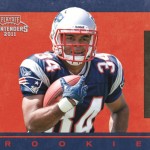
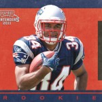
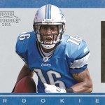
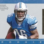
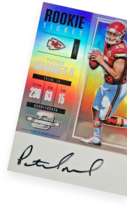
If you look closely at the Rookie Tickets in 2011 Playoff Contenders Football, you might have noticed a slight difference in the photos of the same player.
There are small discrepancies, but Panini America has made variations to all 36 cards in the subset.
Want to know exactly what you’re looking for? Well, check out the photo gallery with pics below. Click on the images twice for a full-size look.
In some of the pictures, you might have to look really hard to find the subtle changes. It could be a removed logo, a missing arm band or a clothing alteration. It’s like one of those touchscreen games where you have a limited time to find the five differences between two pictures.
But don’t worry, you’re not being timed here.
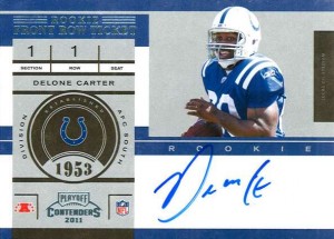
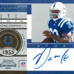
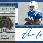
As an example, look at the pictures for Indianapolis Colts’ Delone Carter. In one pic, everything is great as he runs with sunlight splashing him. However, in the next pic, the sunlight is missing from his hand not carrying the ball, and also the logo is missing from the front of the helmet.
It could be that simple.
What differences did you spot in the pictures? The pictures with the missing items are short-printed.
Later in the week, we’ll detail the differences in a post as we figure them out.
Susan Lulgjuraj is a contributing editor for Beckett Media. You can email Susan here. Follow her on Twitter here.


Sooooo….. is one of them a short print??
Hey Beckett,
Here are the differences I found. Most of the cards had 2 variations, but I could have missed a few.
Base Cards
1. Lions logo on helmet and black armband length
2. Riddell logo on helmet and wrist tape
3. Riddell logo on helmet and NFL logo on gloves
4. Riddell logo on helmet and NFL logo on gloves
5. Wrist tape length and wrist bracelet
6. Riddell logo on helmet and NFL logo on gloves
7. Rams logo on helmet and NFL logo on gloves
8. Panthers logo on helmet and elbow band
9. Riddell logo on helmet
10. Riddell logo on helmet and strap on glove
11. Riddell logo and wristband
12. Jersey number on the shoulder pad
13. Riddell logo on helmet
14. Riddell logo on helmet and pinstripe
15. Riddell logo on helmet and hair out the back
16. NY logo on front of helmet
17. Saints logo on helmet and NFL logo on gloves
18. Riddell logo on helmet
19. Riddell logo on helmet and elbow band
20. Riddell logo on helmet
Autos
21. Riddell logo on helmet
22. Riddell logo on helmet, glove logo
23. Raiders logo on helmet and glove colors
24. Riddell logo on helmet
25. Riddell logo on helmet
26. Riddell logo on helmet
27. Glove Color and upper arm band
28. Riddell logo on helmet and NFL logo on glove
29. Logo on helmet and gloves
30. Riddell logo on helmet and wrist band
31. Logo on helmet and something on hand
Base Cards
32. Wrist band and logo on glove left hand
33. Wrist band and logo on helmet
34. Riddell logo on helmet
35. NFL logo on gloves and wrist band
36. Riddell logo on helmet
This is really, really dumb. I understand actually using different photos, but photoshopping out a logo on a glove, or a wrist band on or off a player? This is taking things too far, and messing with one of the premier, and most consistent sets out there. I don’t care if one is short printed, this is just a bad idea.
And the point of this is?
I’m not a fan of deliberate subtle variations.
If you are going to do variations then at least do them on a theme.
Maybe have college logos vs pros. Helmets vs non. Night vs Day.
You can have autographs with different ink colors or inscriptions.
Done right, variations are popular. Look at the Topps pie in the face cards.
Look at the red ink variations for press pass.
You also had productions where one is serial #’d and the other is not.
I always wonder why companies mess up something that is working.
Last years contenders for basketball became contenders and patches and bombed.
Contenders for football always had the hidden short print of some random group
of players and it worked well for them.
I’m with the above. Pointless and uncool variations, not to mention we don’t really know anything about the quantities or if one is SP’d more than the other.
This is a total disaster! From the Pictures they have posted I can barley see some of the differences. I am a total idiot… I need more than sunlight on his hand! I failed at finding Waldo!
My LCS has 2 Mallett ticket cards, 1 with wristband the other without. The short print is?
This is a terrible idea. I agree with Richard completely. Successful card sets have something unique that makes them stand out from the rest. They keep it going year in and year out because it is their signature, if you will.
Contenders signature is their rookie autographs and it was so great in years past because of it’s extensive range of players and random low numbered cards such as Julius Peppers in 2002.
This is a complete rip off of the Topps sp variation (or whoever came up with it first) and I think should not have even of come into play with Contenders.