Posts: 1,221
Threads: 206
Joined: Jul 2012
08-17-2012, 07:06 PM
RE: 2013 Topps Baseball...Thoughts?
i'm not a big fan of the pink parallel, but whatever.
the thing i like are the inserts. they look much more well designed than some of the previous aka "Golden Moments". that design says cheap all around imo.
![[Image: m3OLcuF.png]](http://i.imgur.com/m3OLcuF.png)
Sig by: jbel4331 / STL Cardinals & Rams Collector
Posts: 737
Threads: 20
Joined: Jan 2012
08-17-2012, 07:22 PM
RE: 2013 Topps Baseball...Thoughts?
I like it.......then again I like a cleaner , simpler design vs. one that has a lot going on. I guess thats the vintage fan in me coming out. I am really digging the '72 mini's too!! 
![[Image: 3x75s.png]](http://i1144.photobucket.com/albums/o499/75toppsfan/3x75s.png)
a big shout out to jbel4331 for the AWESOME '75 cards!!
PC:TRIBUTE & HERITAGE & CHROME.GRADED '75 TOPPS & VINTAGE
Posts: 1,350
Threads: 22
Joined: Feb 2009
08-17-2012, 11:44 PM
RE: 2013 Topps Baseball...Thoughts?
(08-17-2012, 07:22 PM)75toppsfan Wrote: I like it.......then again I like a cleaner , simpler design vs. one that has a lot going on. I guess thats the vintage fan in me coming out. I am really digging the '72 mini's too!!
'72 Is a nice set....
Super-Collector of Bernie Williams
Posts: 524
Threads: 58
Joined: Apr 2011
08-18-2012, 08:47 AM
RE: 2013 Topps Baseball...Thoughts?
I don't think Topps learned from 2011 Update. Most collectors of basic Topps don't want so many parallels. I'm fine with the pink, I'm fine with Camo, and I'm fine with emerald, but all three in addition to gold, black, and platinum? Overkill...It's an easy way to put more value in a box, throw in an extra few serial numbered cards that are really the same card with a different border. The inserts are essentially the same as in the last several years, but with "chase" instead of "gold" or "diamond." Don't get me wrong, this is still my favorite product, I love building the set, the 72 mini (or 87 mini or kimball champions or Turkey Red) throwback inserts, and I love the bang for your buck you often get with the HTA boxes, but it really is the same formula year in and year out. I know, if it ain't broke, don't fix it. But it seems like Topps is very cautious about changing it's flagship product very much from year to year these days, whereas years ago Topps wasn't afraid to change from this one year:
![[Image: l_nolan-ryan-1974-topps-20-ex+-condition-1a64.jpg]](http://cdn103.iofferphoto.com/img3/item/508/011/356/l_nolan-ryan-1974-topps-20-ex+-condition-1a64.jpg)
to this the next year:
![[Image: 142331.jpg]](http://www.vintagecardprices.com/pics/1873/142331.jpg)
And both are great! Just saying, it's ok to change things up a bit more.
![[Image: ozziesmithbanner.jpg]](http://i1137.photobucket.com/albums/n515/dlcarst/ozziesmithbanner.jpg)
Always collecting Ozzie Smith!
Posts: 6,744
Threads: 78
Joined: Dec 2005
08-18-2012, 09:14 AM
RE: 2013 Topps Baseball...Thoughts?
I like it for it's simplicity. Looking forward, I think the blue refractor Topps Chrome will look great.
Posts: 2,023
Threads: 147
Joined: Sep 2011
08-18-2012, 02:23 PM
RE: 2013 Topps Baseball...Thoughts?
I think they're ok. I really liked '11, but didn't like '12. At least the '13s will scan better than the '12s. -That was a mistake on Topps part, IMO. (The dark lettering and dark backgrounds dont scan very well).
![[Image: 36cc0864-5f8d-4b58-93b8-fdc0967187ff_zps685e4742.jpg]](http://i1235.photobucket.com/albums/ff429/Uvaspina/36cc0864-5f8d-4b58-93b8-fdc0967187ff_zps685e4742.jpg)
Always looking for Verlander, Cabrera, Maybin, Mike Stanton (marlins), and Avisail Garcia.
*TRYING TO COMPLETE MY VERLANDER ROOKIE COLLECTION. 44/47. ONLY 3 TO GO!*
Posts: 737
Threads: 20
Joined: Jan 2012
08-18-2012, 05:06 PM
RE: 2013 Topps Baseball...Thoughts?
(08-17-2012, 11:44 PM)jtwellsnyy51188 Wrote: '72 Is a nice set....
yep, you are correct there Jeremy. You and I are probably the minority here but I always liked the clean '64 & '86 Topps designs!! LOL!!
a big shout out to jbel4331 for the AWESOME '75 cards!!
PC:TRIBUTE & HERITAGE & CHROME.GRADED '75 TOPPS & VINTAGE
Posts: 1,350
Threads: 22
Joined: Feb 2009
08-18-2012, 05:21 PM
RE: 2013 Topps Baseball...Thoughts?
(08-18-2012, 05:06 PM)75toppsfan Wrote: yep, you are correct there Jeremy. You and I are probably the minority here but I always liked the clean '64 & '86 Topps designs!! LOL!!
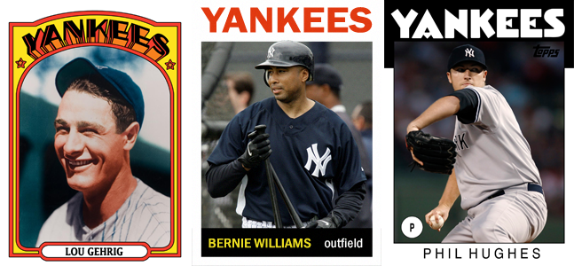
Yea there solid looking cards. My only complaint on '86 is the little circle where it has their position, could do without that on the card
Super-Collector of Bernie Williams
Posts: 737
Threads: 20
Joined: Jan 2012
08-18-2012, 05:35 PM
RE: 2013 Topps Baseball...Thoughts?
(08-18-2012, 05:21 PM)jtwellsnyy51188 Wrote: Yea there solid looking cards. My only complaint on '86 is the little circle where it has their position, could do without that on the card
yeah, probably woulda looked cleaner if they put the pos. next to the name along he bottom imo......
a big shout out to jbel4331 for the AWESOME '75 cards!!
PC:TRIBUTE & HERITAGE & CHROME.GRADED '75 TOPPS & VINTAGE
Posts: 1,819
Threads: 171
Joined: Jun 2012
08-18-2012, 07:59 PM
RE: 2013 Topps Baseball...Thoughts?
I think I'm traumatized from the countless hours of staring at the 1990 topps design as a kid. It's kind of like those stupid stare at the fuzz until you see an image posters. Makes me want to throw up in my own mouth whenever I see one of those cards.
(08-17-2012, 02:19 PM)carolinahuey Wrote: I will go the other way, I've loved the last few releases of the Topps base set. I like it that they are going more simple, it looks like a more 'classic' design and that really appeals to me. When I think of 1995 Fleer and 1990 Topps I cringe, but the 2012 Topps and next year's make me smile.
PC Players: Alex Bregman and Christian Yelich. Looking for any and every I don't have.
Other Players: Luis Ortiz Jr., Rowdy Tellez, Touki Toussaint
|