First look: 2012 Topps baseball (updated)

By Chris Olds | Beckett Baseball Editor
Topps unveiled the design for its 2012 flagship baseball card set on Thursday — the first look at what the company promised would be a “game-changer” of a year for the company’s products.
It looks like it will first attempt that with gold.
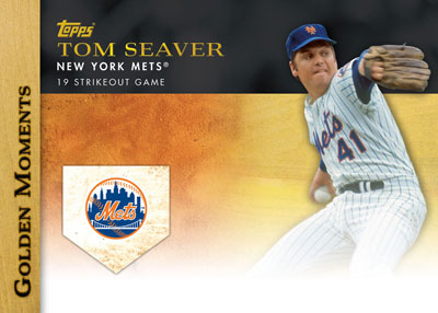
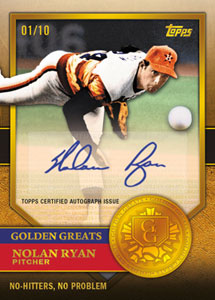
New this year is the Golden Giveaway, a successor to the Diamond Giveaway, which will allow collectors to unlock, you guessed it, cards with gold embedded into them. Code cards call one every six packs and will have a chance to unlock Golden Moments die-cut cards, Chrome parallels of those cards and virtual coins that can add up to win prizes. Also to be found are autographed gold coin cards, which will be limited to just five copies apiece along with 1/1 gold-embedded Golden Moments die-cut Chromes.
Series 1 will include one autograph or Relic in every 36-pack hobby box when it arrives on Feb. 1, while each HTA Jumbo box will include autograph and two Relics in each.

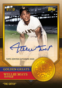
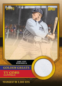
There will be a series of Golden Relics as well, with Golden Greats coin cards limited to the jersey numbers of 15 legends, Retired Rings cards, World Series Champion pin cards, 1/1 Solid Golden Greats (printed on real gold) and Golden Moments 24k Gold Leaf cards.
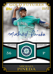
The insert card lineup will include 1987 Topps Minis, Golden Moments, Golden Greats, Gold Standard, Gold Futures and Generations cards. These are all found at 1:8 packs or less.
The autograph lineup will include 1/1 Golden Moments Cut Signatures, Golden Moments autographs, Golden Greats autographs, Epic Walk-offs, Gold Standard, Gold Futures, Generations Duals and World Champions cards. These will all be limited to 50 copies or less save for the Golden Moments, whose quantities were not disclosed.
The Relics will include the sets mentioned above along with In the Name Relics — cards made from this year’s All-Star Game workout jerseys and a 1967 Mickey Mantle reprint Relic.
Finally, there will be autographed Relic cards — all limited to 10 or fewer copies for the sets mentioned here except for the World Champions cards, which will be numbered to 50 — along with 1/1 sketch cards also to be found.
The base set will consist of 330 cards, comprised of 265 veterans, 30 rookies, 10 league leaders, four award-winners, five record-breakers, four World Series highlight cards and 10 career statistical leaders.
Also new are 1/1 Wood parallels, while the 2011 Diamond parallels return this time as Gold parallels while Platinum 1/1s also will be found. Other parallels will include Blacks, printing plates and a partial parallel of the set on silk.
Chris Olds is the editor of Beckett Baseball magazine. Have a comment, question or idea? Send an email to him at colds@beckett.com. Follow him on Twitter by clicking here.
Check out the images below and tell us what you think in a comment below or take the poll.
(Click on the images for an unobstructed look.)


When I look at the player photo, my peripheral vision is telling me this is 1989 Topps.
Hard to judge the flagship design on one card…but first impressions are everything. Right now, this doesn’t scream out “game changer.” They should have shown a bit more.
But as with other designs, this will grow on me.
Sincerely,
JayBee Anama
bdj610
I have a feeling that by “game changer” they mean having the same inserts rehashed for the 10th time
It’s an ok design. However, if that’s game changing, then I’m not worrying about rushing to the store next year.
Ah, that’s because you don’t see the tech behind it.
You push it and it projects a 3-d hologram … or not.
[…] more to see here: 2012 Topps Series 1 Check out the Adrian Gonzalez card. __________________ Collector of Topps […]
topps always has great photos, game changing not sure about that, gold sparklies, not silver, enough with this. to many inserts, even the young teen collector not crazy about them, not as many ture collectors out there to infulence the younger collectors, its all about the autos and patches.
1987 Topps minis? Really? I’m Not Intrigued. And normally I Can’t Wait For Topps Baseball…
If they do another reprint insert set, Im going to go crazy!
those 1/1 wood cards look amazing. They should make the base cards look like that. But out of cardboard. They are too cool to only have one
24-pack hobby boxes?!?!?! Really??? Or was that a typo??
stop all the dumb inserts..and please no more legend variations…a 2012 sandy koufax card is worthless!!!!
To me, the design on the base cards looks very 90s and is a step back from the 2011 design, which I thought looked kind of classic. And there seems to be too many inserts once again. It’s pretty much the same basic product line rolled over again with ‘new’ designs and not much innovation/creativity. Way too many ‘different’ 1/1’s, also. The biggest crime, though, has to be the 1987 minis. That seems to be completely pulled out of the hat.
That said, that Lincecum card looks pretty sweet.
So, any guesses as to who will be photoshopped into the crowd on the Adrian Gonzalez card? I vote for Sam Malone.
So only 330 cards for the whole set next year or is that just Ser. 1 ?
I like the design of the base cards but the inserts are just horrible. I mean really Gold embedded cards ? The Diamond embedded cards were nice as a Anniversary thing but making an every year thing out of it is kinda stupid IMO. I mean what 2013 we get Silver embedded, 2014 Jade embedded, 2015 Topaz embedded, etc…..
Wow Clay Luraschi, when you said “Game Changer” you really meant it (sarcasm). Bloating the product with parallels and inserts and changing from Diamond to Gold is not really game changing it is actually keeping in step with what they did in the 2011 set. A wonderful world that limiting MLB licensing has brought the collectors.
No thanks, I’ll pass. Let’s first see what they do to the rest of their products. Quality control has been lacking lately and all releases are pushed back so they can change the checklists and screw the collectors over.
Stop showing what will be next year and start delivering your products on time.
This year I decided to just stick to buying the factory set. I love Topps, but they just don’t get it. I don’t mind their insert card themes, but they’re too common. I shouldn’t get 1 in every pack. And I don’t know if they did this in 2011, but those ridiculous Topps Town cards actually counted as one of the cards in the pack in 2009/2010.
As a set collector, I had to buy 3 boxes of each series to complete the set. That put me around $350 for the set, some inserts I don’t have too much interest in, and autograph/jersey cards of players like Carlos Ruiz and Mike Fontenot. And now boxes are only going to have 24 packs? While there are some nice looking cards in that preview, I’m not 2nd-guessing my decision to just buy the factory set.
I can’t lie…I bought way more topps hobby boxes the last two years than I ever have. That was mostly because of the million card and diamond card giveaways. I know they gave away mostly junk or good cards that were in really poor shape, but no other company ever tried to do that and I felt like it really captured what was fun about collecting. That being said, Im sick of it now. Topps always seems to find one thing that works well and they run with it. Thats great thinking as far as making more money but at the same time if you keep reprinting cards for the 100th time or keep using the same concept over and over for years it becomes more annoying then fun and exciting. Topps needs to sit down and throw every idea they have ever used away and start fresh. I think if they really sat down really thought about what us fans would enjoy instead of re-making all the cards they have ever produced or putting out a set that has too many inserts to count then they would reclaim the spot of best card brand. What do you think happened to Upper Deck? Idk every time I see the new product that topps is coming out with and I read the comments, they are almost all bad. SOMETHING NEEDS TO CHANGE!!!
enough with all the same inserts. how about quality and enough with the quantity numbers of inserts. they should put more time on the design not the number of inserts. after the first month no one wants the inserts
How’s this for a game changer: stop using foil and stick to plain white (or some other solid color) for player names? How about not including half a dozen or more parallels via Walmart, Target, hobby and other outlets.
I’d love nothing more than to see the Topps flagship line become more respectful of the company’s history and become a more “plain” set. Continue to innovate on the design, but leave off some of the ridiculously unnecessary bells and whistles.
I agree. No more reprints, veteran variations, and so many different inserts. You wanna sp something, SP the all-stars and rookie cards. And I’m not talking 50 ser # either. But somewhat SPed…. Agree everyone?
Nothing terribly exciting about the design. After 60 years, they’ve run out of ideas so much so that they repeat the same baseball design for football (and I’m assuming basketball still).
Find a teenage computer wiz, send him a couple of hobby boxes, and in return get a new idea for a design already!
I like the design quite a bit. But amen to the post about eliminating the foil lettering for the names. I’m so sick of having to tilt the cards to be able to read the stupid names. Makes it really hard to rifle through a stack to look for a particular player or group of players. Isn’t it kind of important to, you know, be able to read the guy’s name and all?
How about instead of giveaway code cards that can be redeemed for vintage cards, insert a vintage card randomly in boxes similar to what Topps did with Topps Heritage. Except this time, please do not ruin the card by stamping it with a gold foil emblem!
Glad to see Willie Mays signature cards back on Topps
Ehh ….. nothing to jump up and down about. Some commented that it looks like 1987 Topps. I was thinking more eTopps from a year or two ago. Definitely not an inspired design. I agree with the others who posted ‘stop the inserts’. They’re getting to the really annoying stage.
I think I’ll definitely pass on the 2012 base set, and focus on my vintage cards next year.
Nothing to see here, folks – move along, move along, move along …………
allways show the impossible odds stuff. great looking cards though, show the checklist of players that you shake your head and say who? / how about you add a kirby puckett card finally, its been years since topps had one. why dont you put the cool retail inserts in hobby and put the standard hobby inserts in retail pks. wasnt jumbos in 2011 have 2 autos and 1 mem per box. pray for panini baseball cards someday.
stop please making fun of topps. first of all they do not even close look like 89 topps,so ryan cracknell know your role and shut the hell up. what do you people want upper deck ,they are getting sued more times than the mets winning the world series. topps is great.
To quote Charlie Brown, ‘Oh, good grief’! Why are we talking 2012 when we haven’t EVEN made it to the 2011 playoffs?! Topps needs to STOP, take a break, think about what collectors want and are looking for, before they try to push NEXT YEAR’S set on us. STOP IT TOPPS! YOU ARE RUINING the hobby for those of us that were actually around & collecting in 1987. They just keep pumping out filler inserts and reprints. I don’t care about contests, online extras (and related cards), or a bunch of eye-candy. Just give us the base card set, a FEW insert sets (less than or equal to 5 sets), and 3 or 4 parallels. Topps has created the newest version of overproduction. It’s called OVERKILL!!! I haven’t bought anything from 2011 (and very little 2010) b/c of the MASSIVE amount of cards coming out for MLB. AND THEY ARE ALL MADE BY TOPPS!!! PLEASE STOP IT, Topps!
Just to clarify my previous response, I did not read everyone else’s posts. I am glad to see so many members agree that Topps has gone way overboard. They WILL end up like UD (and all those others before UD’s failure), if they do not slow it down and try to make what collectors actually want. I am really tired of seeing ‘new’ cards of my favorite players who retired 14 to 40+ years ago. There is absolutely no reason that Ozzie Smith should still have a couple hundred new cards every year when he retired before the ’97 season & was inducted to the HOF in 2002. The same with Stan Musial, who was inducted to the HOF in 1969. I will never be able to gain ANY ground on collecting all of either guys’ cards at this rate! I am soooo sick of MLB cards now. Thanks Topps (for destroying my faith that you’d make collecting BETTER w/ your exclusive rights)!
[…] topps football First look: 2012 Topps baseball (updated) | well 2011 just came out……. but i guess we can expect to get this same design for next years […]
i really miss upper deck. topps has gotten lamer each year since it sued upper deck. i really wish we could go back to having 3 or 4 companies and the healthy competition that ensued. it made for much nicer cards. however, i do really like the bowmans, and chrome cards including the new platinum line that have come out recently. topps needs to completely rethink the base product. it is seriously lacking. thanks beckett, for keeping us up to date! and long live card collecting! i will keep hope alive and pray someone important in the topps co. sees and reads these comments, cause they are pretty much all the same, and all pretty much correct. listen up, topps!
Yeah. Ok. I’m picturing Ty Wigginton or Magglio Ordonez in the
Ryan Braun pose. Cuz thats the type of players which usually fills my boxes.
1 of 1’s? Come on. I’ll win the lottery before I get one of those. No Thanks.
I like the new Topps 2012 Baseball Cards and the inserts cards. Topps 2012 baseball cards are really nice baseball cards.
The design seems to be unfinished. I think the presentation of the player name in the oval is sharp and edgy, but the rest is bland. Call me old-school, but the team name and player position should always be shown. Or if the team logo is going to be used instead of the team name, then it should be larger. I agree with almost everyone that there are way too many inserts for them to mean anything special, although I must admit the Epic Walk-Offs sound interesting. But those would be the first inserts I have been interested in since the World Series Program inserts in the 2004 set. Topps would only need to look on ebay to see that must inserts up for bid draw very little interest. I would not mind the inserts so much if they were not driving up the cost of collecting so drastically. Maybe if Topps sold some insert-free packs with just base cards at a lesser price, I would continue to buy the packs. But I think instead, I will just wait until Topps 2012 Series 2 comes out to buy the Yankees team set and call it a year.
Looks the same as 2011…2010…etc. Enough gloss and gimmicks. Topps needs to get back to unique designs. Remember how you could look at a card and in a nanosecond immediately know it was 1962 Topps or 1975 Topps…etc? This is why Heritage has been so popular this last decade. Another boring set. Too bad.
Thanks,
Jodi
I would have loved to see them carry through the wood border all the way around like on the Adrian Gonzalez card, as a true tribute to 1962, 1987 Topps – which are classics IMHO. 1987 changed the lives of many young collectors.
The wood border would have looked great. (They could have added a “golden”woodlike quality also.
I thought 2011 Topps was a very classy, traditional, yet bold look that I really liked, so this is definitely a let down in that:
1) They didn’t really carry out the “wood” border (a la 1987)
2) They didn’t give us the classic and bold beauty of 2011.
I usually love photography of the cards rather than the borders so… We shall see.
BTW, I really love Topps (It’s CLASSIC) and didn’t like the dillution of Donruss, Fleer and even UD got really cheesy… but I appreciate this quote:
Why are we talking 2012 when we haven’t EVEN made it to the 2011 playoffs?! Topps needs to STOP, take a break, think about what collectors want and are looking for, before they try to push NEXT YEAR’S set on us. STOP IT TOPPS! YOU ARE RUINING the hobby for those of us that were actually around & collecting in 1987. They just keep pumping out filler inserts and reprints. I don’t care about contests, online extras (and related cards), or a bunch of eye-candy. Just give us the base card set, a FEW insert sets (less than or equal to 5 sets), and 3 or 4 parallels. Topps has created the newest version of overproduction. It’s called OVERKILL!!!
Less is more. Remain CLASSIC and Classy.
[…] too early! First look: 2012 Topps baseball (updated) | VT 2011 AAT: Daniel Schlereth #55 LHRP Reply With Quote + Reply to Thread […]
[…] association recently unveiled a design for a flagship label set to arrive subsequent February, and it’s one that sets a new […]
I must be old school, Go back to the days when you would open a pack and there was something in the feeling of the cards you were holding and the cards were not glossy and thick like todays cards and the cards did ot stick together and then you could smell the gum as soon as you broke the wax…….Stop making inserts(if you want auto’s go to a show)and go back to the days of o high gloss.
I wish Topps would have integrated a similar 2010 design wich was awesome, some people don’t collect mini’s but minis were a plus+ and they could have made more gold numbered card’s. A comment on top says they keep re-printing player’s that’s been out of the league for year’s i agree with that comment that’s to much re-production and like i said instead of that they could of added more gold #numbered cards to add over-all value to the product. And another thing i miss is black & white picture card’s of not retired but new player’s in the league.
itl grow on me
All I want is a base set, NO inserts!! I want to go back to the days went I could buy a whole box with 36 packs for $20 or so!
Topps 2012 Baseball series 1 are also very nice baseball cards i like them a lot.
Enough with the inserts already! Just give me a stick of gum and a 792 card set instead. Putting together a set is hard enough without all that other junk.
What Happened To The Old Days When All You Had To Do Is Buy Cards To Make Up A Set And Collect The Players You Like And Collect All The Rookies? Also Get The Updated Set In The Middle Of The Year. There Are Way Way Way To Many Inserts. Like One Person Id Have A Better Chance Of Winning The Lottery Or Maybe I Could Get All The Inserts If I Lived To Be 200 And Im Not To Sure That Would Long Enough. Anyway Lets Go Back To Earlier Years When Collecting Was A Lot More Fun But Ill Be Waiting For The Golden Giveaway To Begin Because I Love Baseball Cards Or Im Addicted To Them Thanks For Letting Me Give A Comment
enough with the 1990’s-current topps needs to get back to the 60’s-70’s styles this was the golden era of baseball card collecting, heritage has brought this back and gives the younger generations a chance to appreciate if topps needs to add give variations at a rate where the average joe has a chbce to collect.
enough with the 1990’s-current topps needs to get back to the 60’s-70’s styles this was the golden era of baseball card collecting, heritage has brought this back and gives the younger generations a chance to appreciate if topps needs to add give variations at a rate where the average joe has a chance to collect.
I just want to know when the topps.com/golden will be up for us to enter our codes. I have already bought a box and a few loose packs and have 10 or so codes to enter. I would have appreciated it if I could have done this the day the packs came out.
Your Topps cards are error cards..Back Stats show 3b in the place of 2bs..I was the first one to discover this error the first day it went on display.about 20% of the cards are marked doubles correctly.Will these be on the market as error cards? Thanks for you time.
the cards look great.. awesome shots and a nice finish. I don’t care one iota about inserts of autographs or golden anything…my son and I collect the cards because its something that we do together. we have fun trying to complete the sets. it gets him interested in playing sports and it keeps him active physically. With this economy and the way these players are paid, we will never be able to afford to go to a real game anymore. gotta watch it on tv and have fun with the cards…but all this “insert” and premium card crap has gotten out of hand since the early 90’s. sad really
I did find another error besides the 3b when it should be 2b. Card #286, Franklin Gutierrez, an outfielder for the Seattle Mariners, has the wrong lifetime stats on the back. He is an outfielder and it gives pitching stats and incorrect teams listed. It does say he was acquired from the Cleveland Indians but they are not listed on his stats.