First look: 2014 Topps baseball cards (with preliminary checklist)

By Chris Olds | Beckett Baseball Editor
The countdown to next year starts now.
Topps released the product breakdowns and additional design samples for 2014 Topps baseball cards on Monday, and the theme for the hobby’s longest-running and best-selling brand is one that focuses on “an unprecedented explosion of young talent, a changing of the guard, as rookies and young stars are playing a bigger role than ever.” In other words, it says, “the future is now.”
Set to arrive Jan. 29, each 36-pack Hobby box will contain one autograph or Relic along with 10 cards per pack, while HTA Jumbo boxes will contain 10 packs and pack one autograph and two Relics per box.

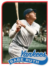
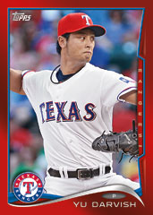
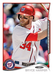
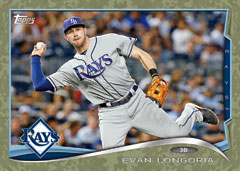
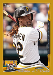
As with past seasons, the base set for Series 1 will consist of 330 cards — a mix of veterans, rookies, highlights and more. Each card will have eight parallels with a new Hobby-only inclusion being Clear parallels, which will be printed on acetate and serial-numbered to just 10 copies. The rundown of the rest of the Topps rainbow will include Gold (/2,014), Camo (/99), Black (/63), Pink (/50), Red Hot foil (one in six packs) and 1/1 printing plates and Platinum versions. There will also be silks for 100 players in the set.
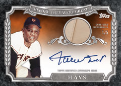
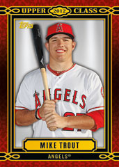
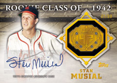
Among the inserts will be 1989 Topps Minis, which will be diecut to remove the white borders and be found only two per box. Meanwhile The Future Is Now inserts and the Upper Class (best rookies) will be found nine per box. Also new will be 50 Years of the Draft inserts — noting key players in MLB Draft history — along with All-Rookie Cup All-Time Team players. Also among the lineup is Before They Were Great, which will pair 30 players’ past and present images. These will be Hobby-only cards with a Gold parallel limited to 99 copies.
Also to be found will be Framed Rookie Reprint cards — a Hobby-only inclusion — with Museum Collection-style cards with Black, Silver and Gold frames. Also included will be Rookie Buybacks — the top 50 players in Topps history.
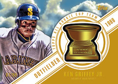
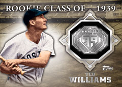
The Commemorative Relics this year will focus on past award-winners in the Topps pantheon along with other stars from the past. These manufactured Relics will be found one per case in standard Hobby boxes and one per HTA Jumbo box. There will be 10 All Rookie Cup players (/99) and each will also have a “vintage trophy” version to chase, which will be limited to 25. There also will be Rookie Cup All-Stars Relics with players who were of note but not along the 10 best. These, too, will have a standard and vintage version. There also will be Class Rings cards for 25 of the greatest players in MLB history — with silver being the standard version and then Golds (/25) and Gold Gems (/25) that have gems embedded into the metal ring embed. There also will be 10 Gems auto cards to chase, with each limited to 10 copies.
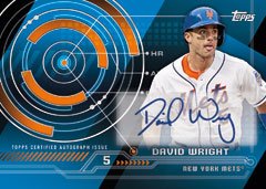
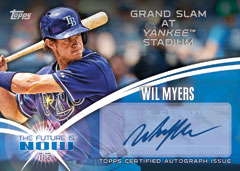
Among the autographs will be Trajectory Autos, The Future Is Now (/25), Upper Class (/50), Before They Were Great (/10 and signed on-card), 1989 Topps Minis (/10), Postseason Performance autos (/50) and World Series Champions from this fall (/50). Relics will follow these same sets with most of them limited to 99 or fewer copies. The All-Star Game’s presence will also be found here with In the Name Relics, 1/1 cards with letters from the nameplates of used All-Star workout jerseys.
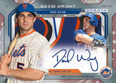
Among the high-end chase cards in this one will be Hobby-only Strata inserts, which will be Strata Signature Relics that combine acetate with autographs and game-used pieces. These will be serial-numbered (quantity not announced) with a series of Strata cut 1/1s also included. In addition, each of the other inserts will have auto-mem versions as there will be Future is Now auto Relics, Upper Class, All-Rookie Cup, Before They Were Great, World Series Champs and Postseason Performance cards to be chased. None of these will be more than 25 copies per card, except for the final two, which will be limited to 50.
Two promotional programs are planned for this release, according to the company, with Pennant Chase cards that can be redeemed for a prize at season’s end along with Spring Fever hobby shop redemption cards found one per Hobby or HTA Jumbo box.
Chris Olds is the editor of Beckett Baseball and Beckett Sports Card Monthly magazines. Have a comment, question or idea? Send an email to him at colds@beckett.com. Follow him on Twitter by clicking here.
—
—


RAW, PRELIMINARY CHECKLIST AS RELEASED BY TOPPS (SUBJECT TO CHANGE)


Looks the same as this year (2013) only with a minor tweak. C’mon Topps get creative!!!!
Love it. Love that the 1989 set is getting the mini/die cut treatment.
Sincerely,
JayBee Anama
what does the new redemption cards look like?????
James: I’m a bit on the fence about that one.
“Each card will have 8 parallels…” – *sigh*
And that doesn’t even include topps Chrome and all of the REfractors, XFractors, SuperFractors and WhateverelseFractors we can squeeze out of the same pictures.
Parallels are officially out of control.
Other than that, and the mountain of inserts, looks like a pretty okay set. They should have gone with the “Red Hot” color for the base instead of white, though.
I am an old school collector and only really care about the base set, and it really reminds me of recent Bowman designs. I have really liked the recent Bowman designs so that is fine with me.
So no blue Walmart, red Target and purple Toys R Us parallels? I bet those are in the mix again… as is the likely orange factory set inserts. We will be at 12 parallels then. Also, am I reading it right that there will no longer be a retro mini design that will have 50 cards per series and will instead have a much harder to pull die-cut retro mini?
Regardless. Too much of the same old, same old. I do like how the design looks in the landscape cards more than the portraits.
Looks like no online contest component this coming year. For how majorly frustrating and disappointing this year’s million dollar chase online game has been, I did actually appreciate the million card giveaway, etc from previous years.
this looks like a futeristic style. I like it
Topps is actually mild with there parallels compared to what Donruss used to give us. I do wish when it comes time for sets like Mini and Chrome feel free to change the photo at least.fred efailki
Loved the 2013 design. 2014 — not so much. Way too busy. Could do without the nickname running vertically down the right side of the card. Too tricked up. Will I put the set together? You bet!!
I like the design! Too many Chase cards! And yes…I too, will be building this set.
Nice but COME ON every year is the same ,you added a clear card (BIG WHOOPTIE DOO) whats the surprise next year made of (BEE SPIT). Every year is a copy of the last I swear you can’t hardly tell them apart.IF YOU can’t design a new card ASK WHO CAN ,your customers ,who better than the people that spend countless hours protecting them ,sorting them.Out of the billions of people who collect I am sure a complete turnaround will be had,New collectors who don’t care about the 60’s 70’s 80’s are wanting uniqueness,originality.Who wants a 2013 Archives 1982 flashback.I do have a few but if there are A****** kids hanging out just to find trouble it it not worth fighting for now-a-days.You have got to make one of a kinds and set a height of standards you will not quit until the last thing on YOUR list is done and forgiven for.Gotta go for a little thanks and I will check them out……………..
overall I like what I see, the shape of the player pic and the team name down the side,,could be a little more different overall, but looking forward to 1/29/14…
look the same as 2013 cards
Baseball card collecting these days sucks. Too many inserts, parallels and cost way, way to money to collect!!!!
The photography gets better every set, but I hate the landscape player cards. Please leave that orientation for the inserts, which I care little about!
They haven’t had good card designs since the 80’s, and no great ones since the 60’s. The 1966 and 67 designs will never be surpassed, but they were done on simple card stock. Today it’s only about how much foil or gold border it has, and nothing about graphic design
These are barely different from the 2013 series. And the fact that Topps/Bowman has used the same Manny Machado picture for so many of their cards from 2013 and this first set of 2014 is hugely disappointing. I have 20 different Machado cards that have the same exact picture on them. C’mon Topps. If you can’t get creative hire me, I’ll spice things up. At least they’re getting on top of their redemption issues.
Just picked up my first packs – the cards look really similar to last year’s, which is very disappointing. The parallels are out of control. Target is definitely doing their red-bordered cards (picked up a couple), which are hard to distinguish from the red-hot foil. In addition, I’ve already seen the gold limited edition (2014), a lime green and yellow inserts, neither of which are numbered. I have no intention of trying to collect the parallel sets, as the cost is far too high. I also snagged an autograph redemption card that says on the back, “At time of production, we were unable to insert into packs the Card of the player(s) indicated on the reverse side of this REDEMPTION CARD.” It also says to allow 12-15 weeks for processing. Finally, it appears there is some kind of contest – the packaging says “Collect the 2014 Power Players.” I didn’t get any, so I don’t know what that means. I enjoy collecting the base sets and I did find a good trading website that helped me piece together some of the insert sets. But these parallels are just silly.
I agree with everyone who said same old same old, Topps really needs to Spice up the Design, after the 2007 Black Border Design, It’s been pretty well the same look every year for the Base Set. Getting Boring Topps. You need some Imagination guys. The Inserts are Great but too many Parallel Sets. Some else said the RED Parallel cards should have been the Base Set and I totally agree.
Like the Mini’s every year they are fun to collect.
Also I hate having card #7 not in the set, too me It’s not a complete set with card #7 Missing every year, I understand the Mickey Mantel thing but come on.
What is the new W.A.R.stat column mean?
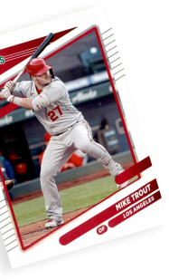
pink Mike Trout limited 1/50