Does extra auto ink negate need for logos?

By Chris Olds | Beckett Baseball Editor | Commentary
The ongoing saga of how collectors might react to Panini America‘s MLBPA baseball cards offered its lasted chapter on Monday as the company teased a number of cards yet to the signed for its forthcoming Prime Cuts product.
And it all left me saying “Who needs logos when you have inscriptions?”
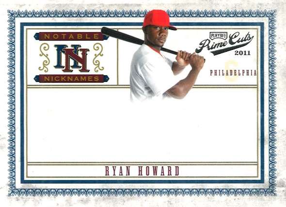
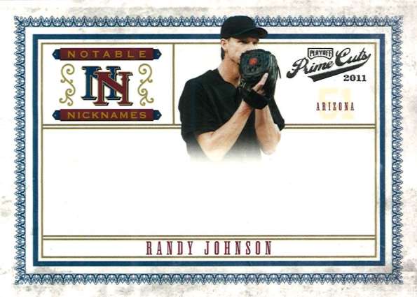
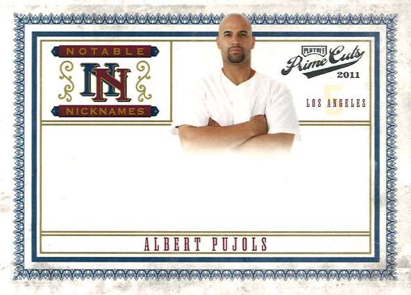
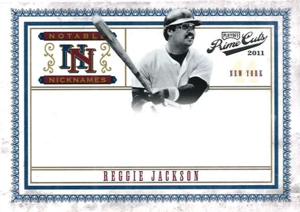
Prime Cuts is set to include a Notable Nicknames autographed insert set — which means Albert Pujols here should be adding something like “The Machine” signed alongside his pricey sig. That’s an addition that doesn’t come cheap.
—
—
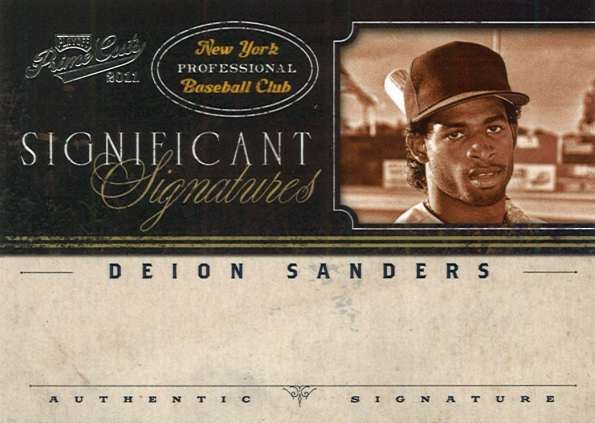
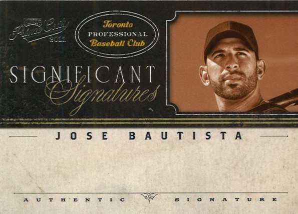
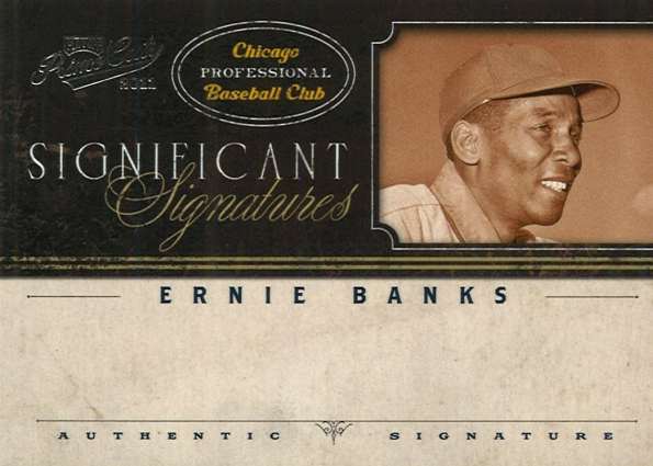
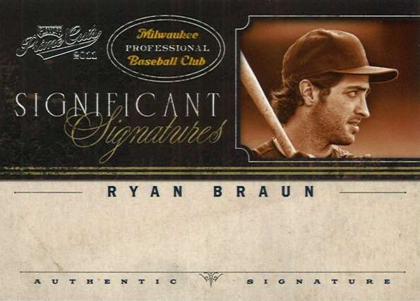
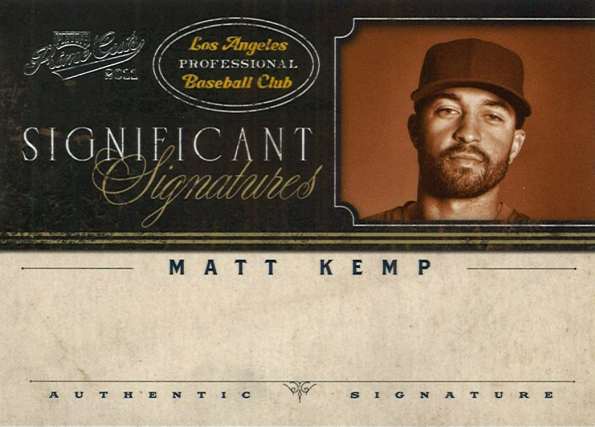
The other insert set, Significant Signatures, uses sepia-toned mugshots as part of the design, a look which also showcases autograph ink. Again, a move that negates the lack of logos in my mind as team colors simply don’t enter the mix.
Maybe I am wrong … maybe I’m not. Take our poll above after you check out the images below.
We’ll see more of the cards — after they are signed — next month.
Chris Olds is the editor of Beckett Baseball magazine. Have a comment, question or idea? Send an email to him at colds@beckett.com. Follow him on Twitter by clicking here.


When are you going to do a box busters on NBA Hoops??
I don’t know, I am still partial to the logos/uniforms/team colors on my cards. I am hoping that Panini gets a full MLB license soon. Just wondering: how can Upper Deck try to do baseball cards like this a few years ago with airbrushed logos, the sides of caps and batting helmets showing to not reveal logos, etc and they get sued and Panini do basically the same thing?
Regardless of the aesthetics, the lack of logos is distracting. No matter how nice the cards look, the first thing you think is “hey, no logos.” On top of that, it’s a reminder that even as something as innocent as a baseball card is affected by big interests and a lot of money changing hands. I’m a pretty casual collector anyway, so this is a pass for me.
its not just the player that makes a sports card, its a combination of the player and team, just look to the 2012 topps the sp. they had the players with there new teams, why was it so important to have them with the new teams, they could have just made the sp. with old teams if that wasn’t part of the formula for a card. it was a combination of the player the team and it being a SP.
It should say, “who needs logos when you have redemptions.”
I’m a fan of the extra ink, although I have no inscribed autos myself…BUT it’s sometimes difficult for me to see the cards with no logos. I don’t think anything can take the place of the logos, but this helps a little. Can we get both?
Lazer: When we get them in-hand.
Anthony: That’s Panini’s goal.
Panini get your paws out of our baseball cards. We don’t want your redemptions in our products.
No logos on the players isn’t exactly new (Topps, 1961 to approximately mid-’70s, where plenty of guys had either no hat, an up from the ground shot that showed bottom of the brim only or a no logo air brush special), but at least the team name was on the card not just a city. While these may be printed on better stock, the overall look of a full shot without logos looks about as cheesy as the old Kraft Home Plate Heroes. Really, Reggie Jackson with “New York” and not even pinstripes? Ernie Banks without that Cubbies C on his cap?
Over 10,000 cards went to a local children’s hospital today. 50 of them were Panini logo-less commons. Would it hurt Panini to put a brand hologram on the back of the cards like UD. Give the common card some clout. They are trying to save ink by making every card a AUTO. But how many months or years will that last at $100 per pack.
All Panini has to do is put their name in Holo-foil with a slight forward slant. But please make a serious effort for a sturdy logo-gram. I would hate to be walking into a store and people stop me and tell me in an excited fashion… There’s a P on your forehead! (My response) A bee! where! (swatting furiously)…….. No! a P!!! (my response) There’s P on my forehead! What!!!! (wiping like crazy with the sleeve of my jacket) ….. a nice logo that doesn’t come off please, thank you.
I personally like the look of those cards. If you’re telling me I can get a nice Griffey AU inscribed “The Kid” on card, I could care less that there’s no logo on it.
I agree – these cards just aren’t the same without logos. That said I was devestated when Donruss lost its MLB license. I always liked their creativity with baseball products and appreciated the number of hits they always included in their products. Don’t know why topps never piggybacked off the hot box idea that panini continues to use. I was skeptical when Panini bought out Donruss – I think there was a bit of a transition, but I am excited about the direction the company has taken, and I believe they are being aggressive enough to eventually get that license back. Good luck Panini!
I’ve always been a huge fan of Logos and never thought I’d ever purchase a card without logos on it but this product has me thinking otherwise. I hate receiving cards with cut-off autos because the player couldn’t get it all on the sticker and with this I would get a full, clean well-written auto.
Yeah, sign me up for Prime Cuts. I’ll give it a shot.
They just seem sort of blah…no spark (and I’m an autograph collector)
The only way they might make it more alluring is to increase the hit rate (ie success of getting star auto) vs. the competition
We’ve certainly seen a great many cards issued by many different companies over the years that didn’t have logos on them. In almost all cases of discussing these types of cards with customers, these cards are considered inferior for two reasons: 1. People like the logos/names of the team and 2. they aren’t properly licensed.
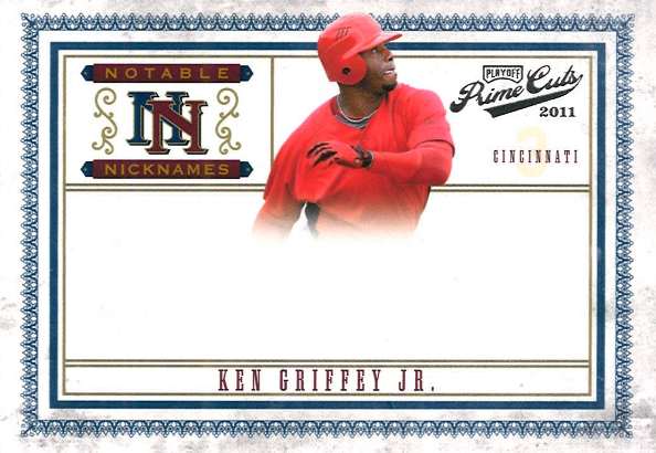
A player collector may be into the Ken Griffey card with the extra ink on it but he probably isn’t into a whole set issued that way – no matter how good the cards look. Historically, when cards aren’t licensed properly, we, as a collector base usually don’t even consider these cards legitimate. Would you like a card autographed by Albert Pujols in his uniform or him standing in a suit somewhere?? I think the logos and team names are still critically important to the cards..
David: One catch. They ARE properly licensed and completely legal. They are just not licensed by MLB, allowing MLB’s property (its logos) to be shown.
it’s kind of like do you like a jumbo patch card that is all one color or would you like to see the logo, i think it safe to say that you would want the colorful logo, this is an extreme example but it what helps the card sell. just like a uniform.
I think it will do OK, look at products like Leaf cuts that have no logos and yet still sell.
I think they would do better WITH the logos, but I think it can survive w/o it, at least
for a single product.
Consider 91 Studio. In its time, it was pretty popular. People like seeing their heroes
in civilian garb once in a while.
the only saving grace for Panini is that the cards dont look cheap and that they are designed nicely, and its always a plus when there a little extra ink. i just wish they did have the mlb license because those are some of the nicest looking designed cards ive seen in a while
Chris – Unless you can explain to me the difference between this and say a Potato-chip disc (the extreme case here) from the 70’s, or any number of cereal prouct-based card sets from the 80’s and 90’s then I would disagree with you. ALL of those cards ( and many, many others over the years) have the MLPA License but not the MLB Properties license. These, if I understand correctly, are no different in that sense. In the past, “legitimate” card needed to be licensed by both parties to be considered legal.
The major difference here is availability and distribution. We can all shrug off regional issues or a food brand card but Panini has such a wide distribution that the collector base can’t really ignore it. These cards don’t look bad – but they would look so much better if they had logos on them.
David: These cards are perfectly legit as in they are legal and fully authorized to show what they show. I’m looking at it from an authorization/legal standpoint, while you’re looking at it from the traditional collector expectation standpoint.
Chris – exactly who’s point are you arguing here? Every card I mentioned was “fully authorized to show what they show”. They all had the Players Association license but not the MLB Properties license. They simply weren’t considered as “legitimate” as the fully licensed products of the age whether it was Topps or anything else for that matter. Your ultimate question “Does extra ink trump no logos?” is all about “traditional collector expectation” becuase a large part of our industry is traditional collectors – which is to say, older collectors. Kids may not care as much but those of us who have collected for 30 years know the difference.
The very same issue came up in 2010 when Upper Deck lost it’s MLB Properties license and the question was really never answered because UD didn’t try to make a set based just on the players without the logos (they decided to try it with logos – even though they didn’t have a license). They could have tried but they didn’t.
In the end, these cards do look really nice, the design is solid, the production value will be high and the collecting community will buy them – but I don’t think there is any question that they would look and sell better with logos on them – extra ink or not…..