Posts: 519
Threads: 54
Joined: Jan 2006
07-01-2015, 03:14 PM
Vintage Football Card Design - Best/Worst
I have been looking at some of my old cards and found that I really like some and really dislike others. I wondered what others think....remember vintage means 1981 and earlier in this case...basically any card that would be graded BVG vs. BGS by Beckett.
I like the 1969 Topps but really dislike the 1970 Topps which I just find boring.
I also really like the old cards that look more like paintings rather than photos like the 1952 Bowman.
Honorable mention is the 1966 Topps with picture showing inside of a television.....kinda cool.
Posts: 1,850
Threads: 263
Joined: Feb 2013
07-01-2015, 04:02 PM
RE: Vintage Football Card Design - Best/Worst
One of my favorites for some reason: 1948 Topps:

I really like '68 Topps, too:

One of my least favorites, I think it was 74 topps (the top ones, not the bottom 3):

The combination of poor card design with the terrible 70's photography quality, and the 70's style the players had I just don't like.
Posts: 574
Threads: 32
Joined: Sep 2013
07-02-2015, 08:57 AM
RE: Vintage Football Card Design - Best/Worst
'69 is one of my favorites as well.
Top 5 in no particular order
1. '69 Topps
2. '59 Topps
3. '68 Topps
4. '75 Topps
5. '55 Bowman
The early 50's Bowman are nice and simple as well.
The 70's were pretty bad, I actually kind of like the 1970 Topps compared to the rest of the 70's.
Posts: 519
Threads: 54
Joined: Jan 2006
07-02-2015, 11:16 AM
RE: Vintage Football Card Design - Best/Worst
I have been working on a graded 1958 set.....not because I really liked the way it looked so much but am a Jim Brown fan and that's his RC.
Posts: 3,376
Threads: 282
Joined: Sep 2007
07-02-2015, 09:44 PM
RE: Vintage Football Card Design - Best/Worst
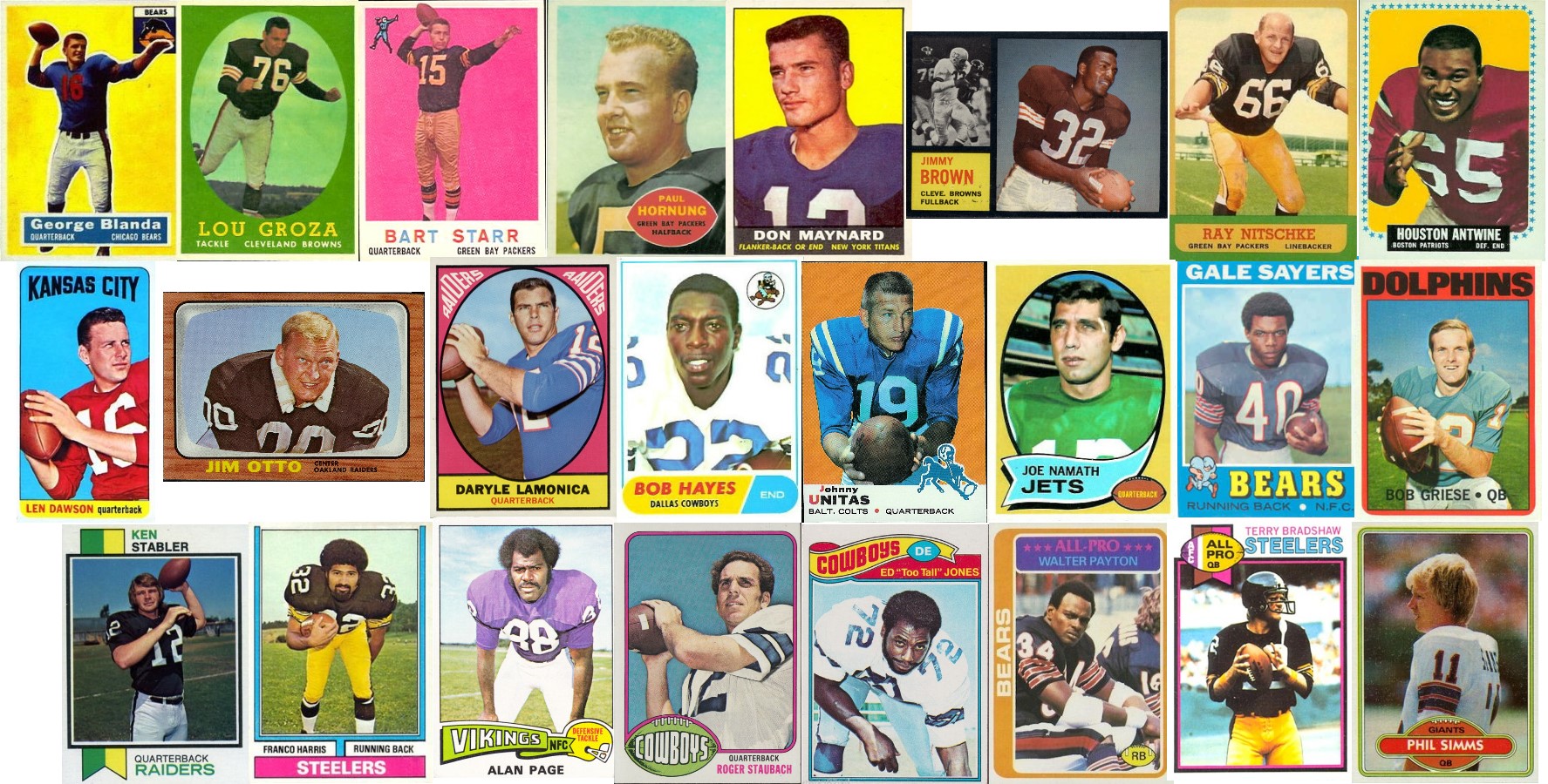
Topps vintage football throughout the years.
In terms of the "cleanest" or least cluttered look I'd give it to 1960 (Hornung) and 1980 (Simms).
For set design 1962 (Brown) looks great with the pose and action shot and slick black borders. I'm also partial to the '73 (Stabler) and '79 (Bradshaw) with the two tone flag. If they had used team colors it would have looked tons better and tied the design to the player.
The one that shows it's age the most is the 1966 (Otto) is my least favorite
Favorites:
1. 1962
2. 1980
3. 1960
4. 1979
5. 1973
Least favorite:
1. 1966
2. 1967
3, 1964
4. 1976
5. 1959


![[Image: DmasciBanner.jpg]](http://i1147.photobucket.com/albums/o558/dmasci/DmasciBanner.jpg)
